
please judge my book by its cover!
EXCLUSIVE! REVEAL! NOVEL!

Hi! I’ll just cut to the chase here:
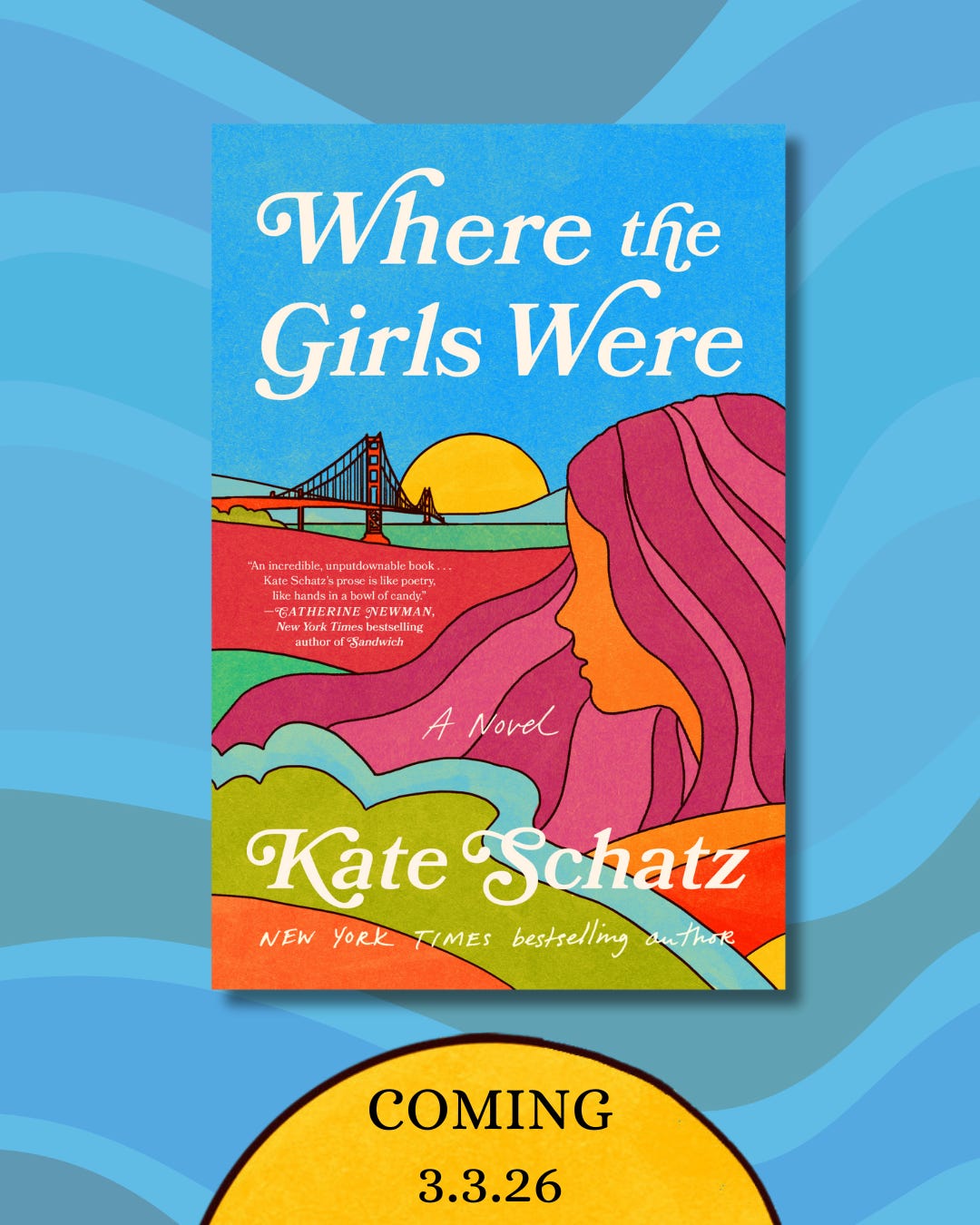
I WROTE A NOVEL AND IT IS COMING OUT IN MARCH AND HERE IS THE GORGEOUS COVER THAT IS BEING “EXCLUSIVELY” REVEALED* TODAY ON (IN?) PEOPLE:
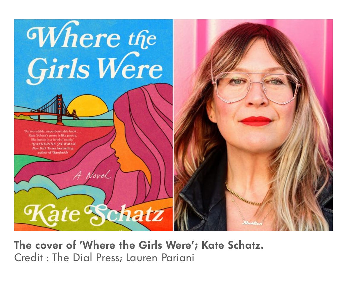
Aaaaaahhhhhhhh! Isn’t she STUNNING?
(I’m talking about the cover, but hey, the new headshot is good too! My wife took it last Friday evening! I got home from helping coach a Little League practice and did a quick-change from Mom/Coach to Author Lady and we drove out to the decommissioned naval base near our house where there are a bunch of shipping containers that have been repurposed and painted pretty colors and she took one million photos of me with her nice camera and fancy new lens and I kept wondering how models figure out what to do with their hands and how they make so many different expressions because I feel like I have 4 different things my face can do? Anyway! She took a bunch of great photos and it’s a really nice feeling to look at one million photos of your middle-aged self and actually like a lot of them!)
Anyway! Let’s look at that cover again, shall we?
Look, I realize that I could play it cool here. Like, chill and blasé and “hey guys I did a thing.”
Nope. No time for false modesty! Because there’s so much bad shit, and bullshit, and batshit, and horrific racist mind-numbingly evil shit and I am very convinced that we need to go hard in the paint with all the joy and exciting news and empowering things and good shit! And also: I am VERY proud and excited!
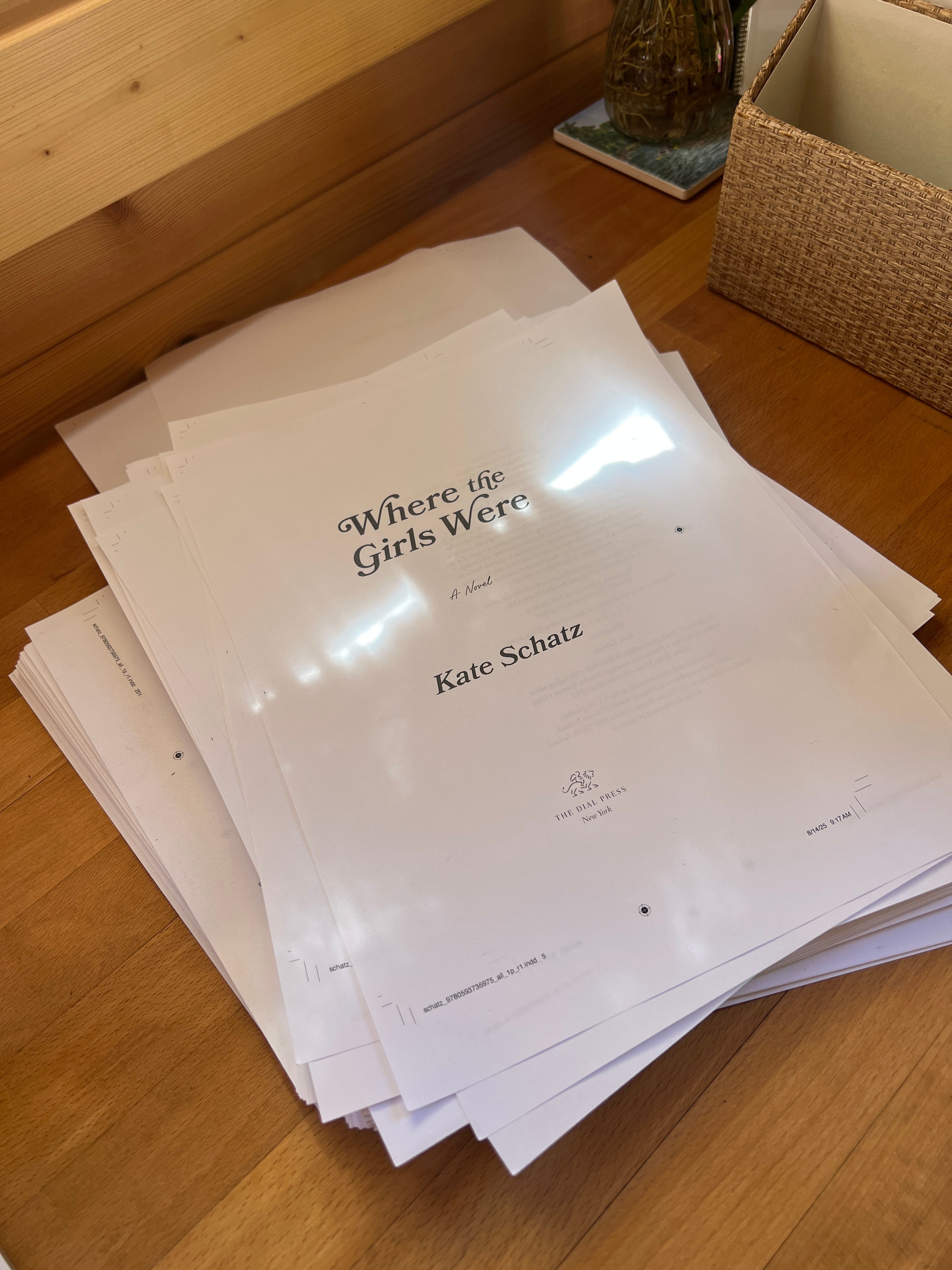
My novel is called Where the Girls Were, and it comes out on March 3, 2026, on Dial Press. I know! That’s very cool and exciting and so long from now! It is—and it isn’t. Because time is fucking weird, and in the Book World, the work of publicity and marketing begins 6 months pre-pub (which is Industry-Speak for pre-publication). Which is, roughly speaking, where we are now.
Speaking of time, I began writing this book about 15 years ago. FIFTEEN YEARS, ok?! It has taken many shapes, with drafts morphing and shifting in tone, point of view, scope, feel, and title. Many iterations, but it was always the same core story: San Francisco, 1968, a pregnant teenage girl sent away in secrecy to a maternity home. The girls she met there—also pregnant, also hidden away. Free love, Vietnam, and hippies—and also illegal abortions, forced adoptions. The desire for choice, agency, and freedom, as well as my own desire to tell a story about an experience that thousands of women—including my own mother—buried in shameful silence for decades.
Sometimes I feel sheepish that it “took me that long” to finish the book but then I remind myself that a) it takes as long as it takes and b) novels are really hard to write! and also c) during these past 15 years I published six other books. With collaborators! (Thank you Miriam and Kamau! I love you!) Three of which were NYT bestsellers, and all of which I’m incredibly proud of. (I also taught full-time and raised two kids. Oh and I got a divorce and got remarried! What a ride!)
Point is, I spent many years writing this book, and many years revising and editing it, and I’m grateful for all of that time because it’s the way I taught myself how to write a novel. And I think I did a really good job! Hopefully you will read it eventually, but until then, let’s talk about book covers.
Almost every time I’ve shown someone a new book cover design they preface their reaction with some variation of “Ok, I KNOW I’m not supposed to judge a book by its cover but…”
This aphorism has been drilled into our brains forever, so I understand why people say this, but
I AM HERE TO TELL YOU THAT IT IS ABSOLUTELY OK TO JUDGE A BOOK BY ITS COVER! DEFINITELY PLEASE DON’T JUDGE HUMANS THAT WAY BUT BOOKS?! WTF DO YOU THINK COVERS ARE FOR! JUDGE AWAY!
I mean yes, covers are there to contain and protect the pages. And to tell you the name of the book, and who wrote it. But even those details are part of the extensive process of signaling to you what, in fact, is contained inside. That process includes the colors, the fonts, the graphics, the illustrations, as well as the lack of colors and graphics and illustrations. It all works together to telegraph vibe, tone, time period, genre. To tell you what the book is, who it’s for, what it’s (hopefully!) going to feel like.
These design decisions are made not by AI, but by living breathing working humans who use their human brains and creativity and hearts and artistic visions and analog aesthetic sensibilities to make your human eyes/heart/brain do EXACTLY what you think you’re not supposed to do! Judge a book! To make you pause, pick it up, and think “Oh wow this looks cool” or “Hmmm, what’s this one about?” or “Definitely a book mom would love! Gotta get this for her.”
A few months ago my editor Clio asked for my initial cover ideas for Where the Girls Were. I said that I would love something that references vintage paperback novels BUT feels contemporary, and also gives a 60s vibe without being too cliché/on-the-nose—I didn’t want a barefoot pregnant hippie flower child with peace signs and a daisy crown. (I just went back and looked at that email and I did in fact say that “I would not be mad if the Golden Gate Bridge was involved.” They listened! I love it!). I also made a Pinterest board with all kinds of paperback covers from the 60s and 70s that I love—lots of bold colors, good illos, fun fonts, compelling vibes.


The book cover process is exciting and terrifying, because I am the author not the designer (thank god, because while I’m a decent artist when it comes to drawing and painting, I am shit with graphic design). I want nothing more than to love my book covers—and I have very little to do with them but also really strong opinions about them! It’s definitely nerve-wracking to wait on cover designs, and I do have friends who’ve been super disappointed by theirs and have had to engage in some really challenging back-and-forth feedback rounds with editors and designers. So I feel VERY lucky and relieved that when I finally got the first round of designs I loved them. I had a few small pieces of feedback, and when the second round came back, that was that! Boom! Thank you thank you to Donna Cheng, Art Director at Penguin Random House, and Sara Wood, the illustrator (who has done many covers, including the one for The Love Songs of WEB DuBois, a book I absolutely adore). They really just nailed it. (UPDATE: Sara just said yes to my request that I interview her about her book cover design process so stay tuned, I think that’ll be really fun to share here!)
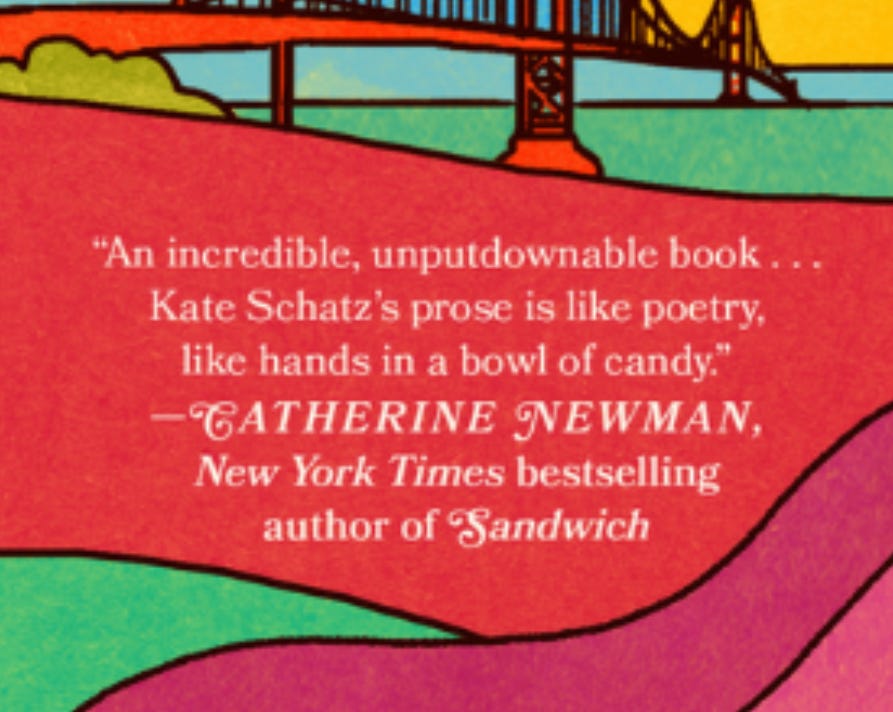
Another key component of the book cover grab for eyes/hearts/dollars is the BLURB which I think I’ll write a whole separate thing about—but having a line or two from a notable author whose devoted readers might overlap with (and become) your own potential devoted readers is important. I’m beyond chuffed that my cover features words from the inimitable Catherine Newman, the Patron Saint of All Things Good and Hilarious and Heartfelt and True. Pre-order her next book—and make sure you’ve read Sandwich, and We All Want Impossible Things.
For the next many months I will be talking a lot about this book here on this Substack. I will constantly remind you to PRE-ORDER MY BOOK but I’ll also try my best to keep it fun and interesting and engaging and, you know, author-y and inside baseball-y (and not too gross and thirsty), because I think there is so much fascinating stuff that happens behind the scenes. I mean I love that kind of content from fellow authors (the author-y stuff, not the thirsty stuff), so I figure (I hope!) people will enjoy that from me too.
(Fun fact: did you know that all books are published on Tuesdays? Also albums come out on Fridays. You’re welcome. And yes, I will make a Spotify playlist for the novel!)
I’ll have all kinds of things to share and say about the book, the process, and most of all—knowing me—the real histories behind the fictional world. I look forward to sharing with you!
Also, because this dispatch might get a decent amount of traction, here are some links to organizations that could use your support right now. So yes, ideally buy my book AND make a donation. But honestly? If you have to choose where to put your dollars, choose one of these:
HEAL Palestine This Ohio-based non-profit recently brought 11 severely injured children from Gaza to the U.S. for emergency medical treatment—three of the children (Layan, 14, Ghazal, 6, and Anas, 8) were brought to San Francisco for surgeries related to injuries sustained in bombings. The State Department just suspended the Visa program used to bring these children here, but this org continues to fight for these children.
The Immigrant Relief Fund by Faith In Action East Bay This fundraiser is local to me, so if you’d rather support an Immigrant Relief Fund local to you, that’s great. ICE, America’s 21st century Brownshirts, are violating human rights in communities everywhere, so donate where you can, y chinga la migre por siempre.
The Trevor Project LGBTQ+ youth need this organization, and this organization needs our support.
Donate to an abortion fund near you. These local funds help people access the medical care they need and deserve.
XO,
Kate
It is a stunner. It's giving serious SF Summer of love vibes. "Nothing you can know that isn't known. Nothing you can see that isn't shown. There's nowhere you can be that isn't where
you're meant to be. All you need is...."
I cannot wait and I love this cover so much and also you so much and !!!!!